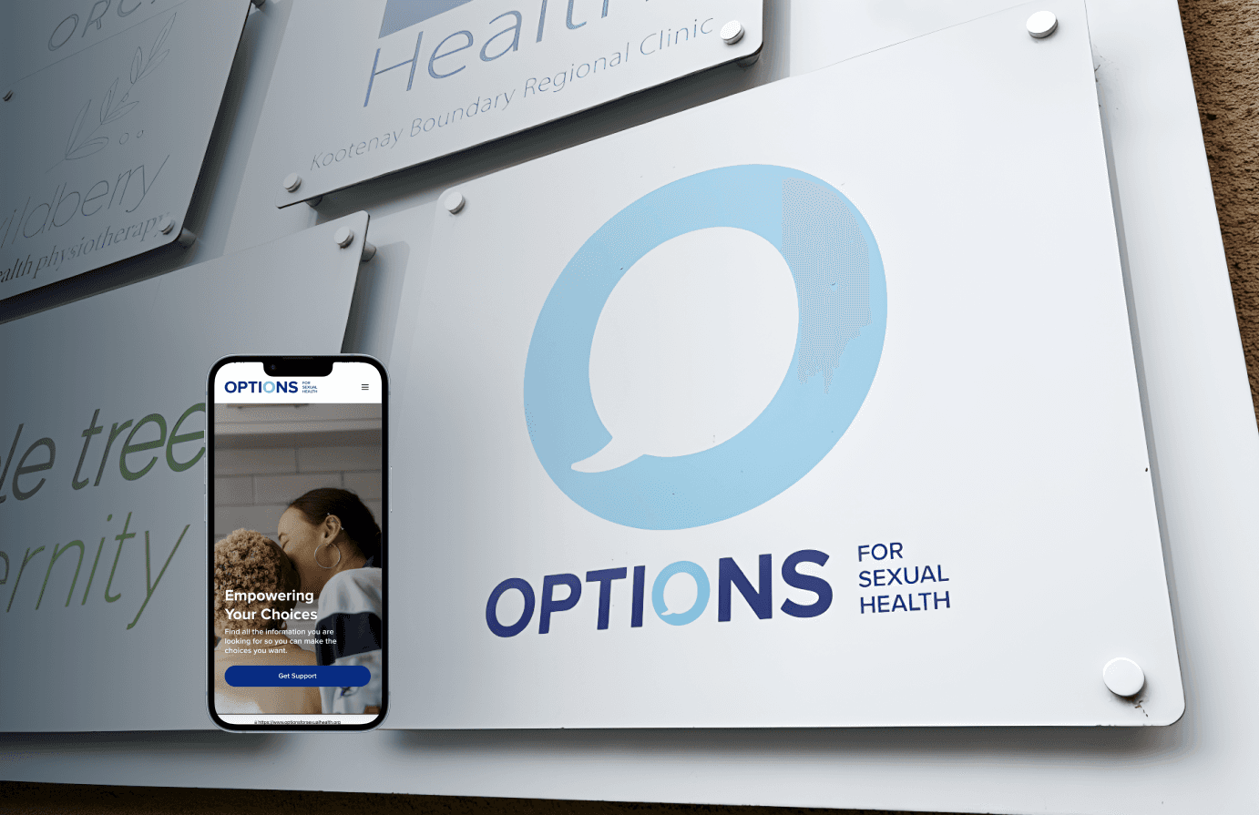
UX/UI Design
Streamlined access for Options for Sexual Health
Skills
UX Research
UX Audit
Wireframing
User persona
Prototyping
User flow
Tools
Figma
Duration
2 Weeks
Team
4 Designers
The Problem
Many Canadian youth struggle to access clear sexual health information. Existing resources on the page were hard to navigate and caused a lot of friction for users.
In this 2-weeks hackathon challenge, our team partnered with Options for Sexual Health, a nonprofit that provides sexual health education and services.
The Goal
Our goal was to design a mobile-friendly platform, specifically an onboarding process, that helps youth aged 16-25 easily find information on sexual health topics like pregnancy and STI, and connect with supportive resources in their area.
My Role
I did the UX research by interviewing and surveying users, participated in the wireframing sessions, and worked on the high-fidelity prototyping.
The Process
Research + Insights
We started our research by first conducting a quick UX audit to identify UX issues, evaluate effectiveness, and suggest improvements. We then conducted a survey with 8 individuals and 4 interviews via Zoom to gather general information about resource accessibility and user needs.
General first impression show that the homepage suffers from content overload, unclear navigation, and low visibility of key user tools like booking and STI info. A more focused layout and prioritized content could improve engagement and task completion.

Research Highlights
Users felt lost on the homepage

"I came here for info on birth control but didn’t know where to go."
67% couldn’t find what they needed
“Maybe they better to let people know how to book an appointment better (get checked online, when I see this link, I always feel like whatever, I'm just gonna call the clinic and book myself.”
— From the user survey
This research pointed to two key issues:
Issue #01
Users struggled to access essential information, particularly around STIs and pregnancy.
Issue #02
Many couldn’t figure out how to book an appointment due to wordy available resources and lack of clear navigation.
User Persona
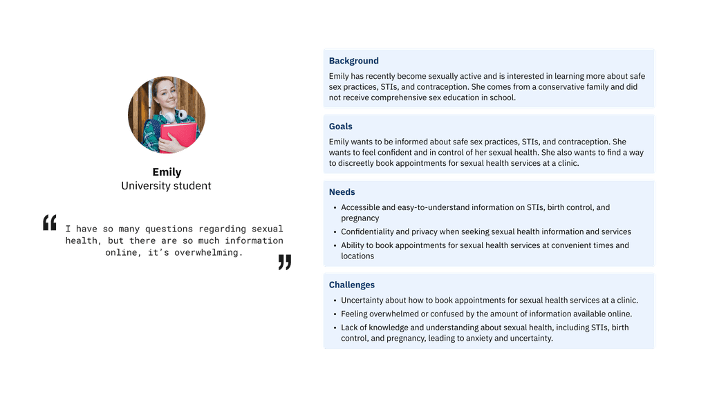
Based on the research results, we reframed our main question and narrowed down the topics that would guide our design process:
How might we improve the accessibility of clinical resources related to STIs and pregnancy for young adults in B.C utilizing Options for Sexual Health's services, helping them to efficiently address their sexual health concerns?
Design
This user flow was designed to help users locate the right information before they result in booking an appointment or call. Based on research insights, we focused on creating a clear and empathetic path that reduces confusion and directs users to relevant services or appointment booking if that's what they are looking for.

Due to time constrain we did rapid wireframing and created the prototype that filters the information through an onboarding process.

Prototyping + Outcome
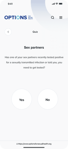
We built a mobile-first onboarding flow that helps young users quickly find information regarding pregnancy and STI support through self-identify their goals, whether that was finding a nearby clinic, learning about pregnancy-related topics, or getting STI support. This is an added feature to the homepage’s hero section with a clear CTA guiding visitors towards finding the information in an efficient way.
Our prototype tackled these problems through:
01 Guided onboarding questions for first-time visitors
As first-time users, many may be experiencing stress or urgency while seeking support. To ease this process, we introduced a guided onboarding flow that shows empathy by simplifying navigation.
We grouped key needs into four clear categories and asked users a short series of goal-oriented questions. Based on their responses, the system directs them immediately to the most relevant resources, reducing decision fatigue and increasing user confidence.
This approach helps users feel supported rather than overwhelmed by the information.
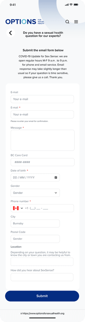
02 Contextual resource suggestions after onboarding
After completing the onboarding questions, users arrive at a personalized results screen that could either be specific information about pregnancy and STI or booking an appointment straightaway.
Rather than presenting a generic list of links, our result screens provide users with:
Surfaces the most relevant tools and services like Telehealth and SexSense.
In more serious cases it directs them to find a nearby clinic for them to visit.
This final step empowers users to take informed action without shifting through dense or unrelated content.
03 Clean UI prioritizing readability and accessibility
We applied a mobile-first, minimal interface design that enhances both readability and accessibility.

Home
Information Pages
Short Quiz


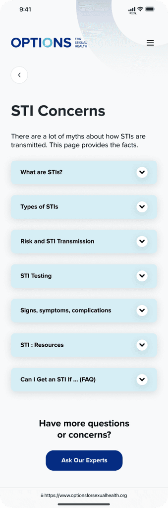
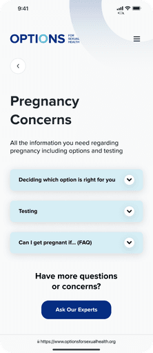


Result Page > Contact SexSense | Use Telehealth | Book Appointment through Calendar


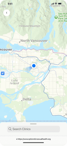
Clinic Locations
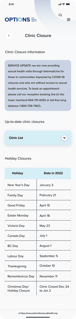
Clinic Information


Takeaway
This project was far from perfect, but it was a huge learning experience. With such a tight timeline, our first approach was to do a whole redesign and information architect of the website since the information density was the main problem. However, halfway through, we realized a mobile-first approach made way more sense for our younger audience, so we pivoted and rebuilt everything in just two days. This experience proved it to me how how important is to have a user-first mindset and think about the audience from the very beginning regardless of what main technical problem the website has.
For this hackathon we decided to focus only on the two most-searched topics (STIs and pregnancy) to make the biggest impact with the time we had. If we had more time, we’d definitely expand the project to include more appointment types and resources. There’s still a lot of room for improvement, but this was a solid first step toward making health resources more accessible and user-friendly.