
visual design
Shaping the Visual Language of Pop Arts Fabrics and Fashion
Skills
Art Direction
Copy Writing
Research
Mockups
Microsite
User flow
Tools
Figma
Photoshop
Duration
6 Weeks
Team
5 Designers
The Challenge
For this conceptual project, we were challenged with creating an art direction and digital presence for TextielMuseum’s “Pop Art Fabrics & Fashion” exhibition in Netherlands. The goal was to design a visual identity that reflected the bold, playful spirit of Pop Art through design experimentation and research.
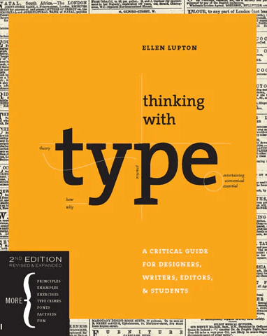
By analyzing the visual systems of Wolfgang Weingart and applying Ellen Lupton’s design principles, we developed experimental layouts and a unique design language that would guide our design decisions.
My Contribution Summary
Did weekly poster iterations that shaped the evolving visual language and final art direction of the exhibition.
Wrote and refined copywriting for the microsite and promotional materials to reflect the tone of the exhibit.
Created high-fidelity mockups using Photoshop and Figma to visualize branded merchandise and marketing assets.
Designed and prototyped key interaction moments for the microsite, exploring hover states, animated transitions, and responsive layouts.
Research + Insights
To craft a bold yet strategic visual direction, we began by studying influential design voices: Wolfgang Weingart, known for Swiss punk typography, and Ellen Lupton, whose principles shaped our structural foundation.
We used a structured exploration approach combining syntax and semantics to draw out impactful design traits we could adapt to the exhibition’s tone. For this we did the following:


01
Extracted Actionable Visual Qualities
From Weingart, we identified techniques like overlapping shapes, boundary-breaking layouts, and typographic experimentation.

02
Mapped Principles to Practices
Using Lupton’s design principles (from Thinking with Type and Graphic Design: The New Basics), we aligned those techniques with user-friendly hierarchy, rhythm, and contrast.
03
Built a Visual System
Our experiments led to a modular visual system that prioritized legibility while capturing Pop Art’s energy. This included a grid-free layout foundation using strong geometric forms. Below is the timeline of our work.

Choosing the Visual Direction
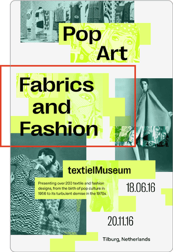
To reflect the bold energy of Pop Art while maintaining clarity and modern appeal, we explored several visual directions inspired by our research into Wolfgang Weingart and Ellen Lupton’s principles. This lead to aspects of their design to be selectively used in the final translation into the microsite.
Key Concepts We Developed:

01
Overlapping Geometric Foundations
Drawing from Weingart’s montage and typographic experiments, we used layered geometric shapes as a visual structure. This allowed us to create energetic layouts without sacrificing readability.
+
02
Breaking the Grid
We intentionally disrupted traditional frame boundaries to reflect the rebellious nature of Pop Art, echoing Weingart’s non-linear compositions.
+
03
Modernized Neon Palette
To strike a balance between nostalgia and contemporary design, we applied a limited, neon-inspired palette. This allowed the work to feel vibrant yet restrained, aligning with both the Pop Art theme and modern design sensibilities.
Why This Direction Worked
By using a bold but simplified system, we created a unified identity that could scale across posters, signage, and digital components, reinforcing the exhibition’s legacy beyond the museum.


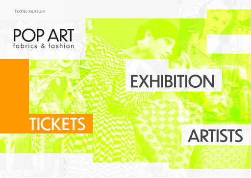
Translating to Microsite
Our goal for the microsite was to engage new audiences and spark their curiosity about the artists. The site needed to express the exhibition’s vibe while offering memorable experience. We achieved this through:
Clear User Journey
We designed a user flow that guides visitors from discovery to action, offering quick access to the exhibition overview, key artists, visuals, and a clear CTA.

Unified Design Language
Every visual choice, from the typeface to the color palette, mirrors the printed collateral and physical mockups, creating a seamless bridge between the exhibition space and the digital platform.
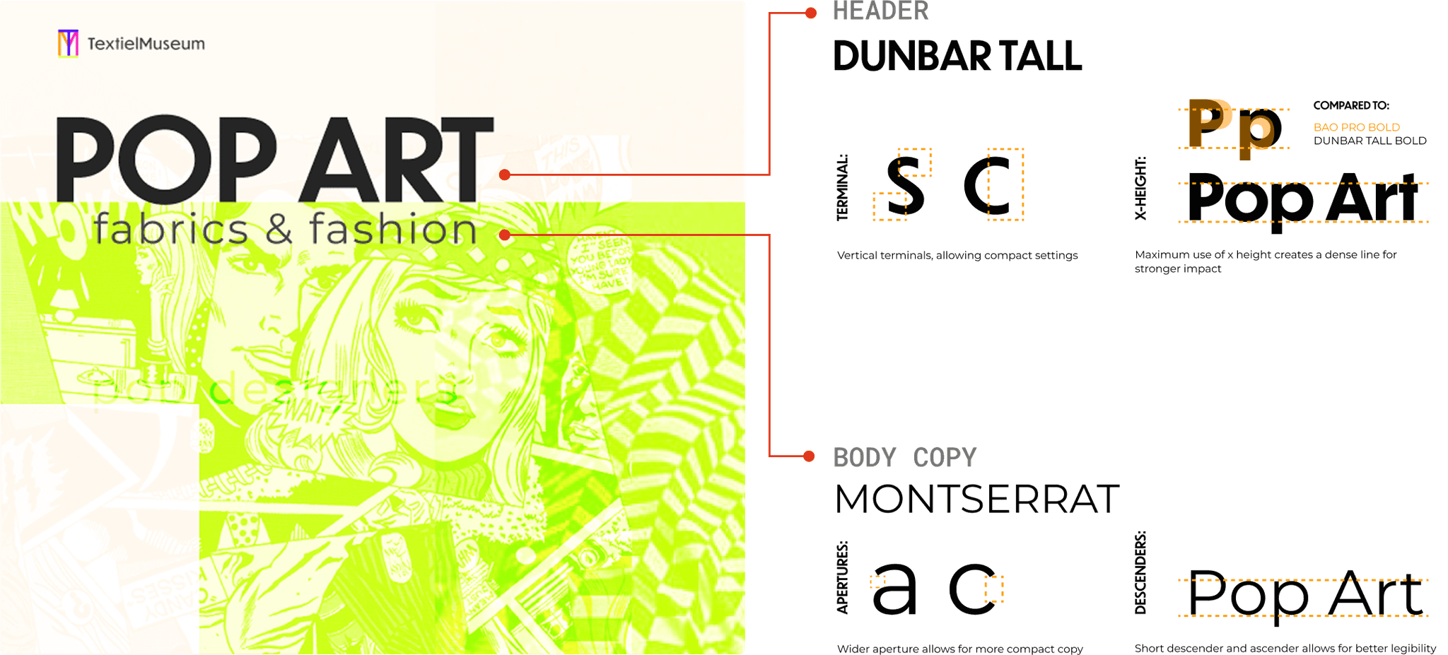
The brightness brought by neon monochromatic palettes stimulate varying levels of alertness to engage and lead users through the content.


The retro display of Dunbar Tall with an longer stature resembles the 60s and 70s iconic typefaces presenting the history of pop art while holding contemporary aspects of clean, sharp edges for legibility.
Likewise the utilitarian form of Monserrat is free of distracting features binds well with pop-art aesthetics, using its neutral yet familiar features to ground the content.
Fusing the old and new, Dunbar tall’s retro feel and Monserrat’s functional form parallel the idea of revitalizing pop-art with contemporary energy.
Expressive yet Functional Interactions
With overlapping geometric shapes as the dominant quality in our art direction, we intended to make most of our interactions using this quality, as shapes are flexible and can be manipulated in many ways.
Shape Morphing to Open Pages
Having new pages slide into view keeps details organized and more functional for systemic interaction such as purchasing, creating more seamless interactions and granting the user a sense of reliability and confidence in their actions on the website.
Additionally I believe keeping grouped content hidden allows users to interact with only the most pertinent details at a specific time of their journey.
Hover to Reveal Media
The interaction allows users to reveal audio-video content, heightening their excitement because it is more enjoyable to invest in a passive activity that stimulates different senses, increasing their desire to attend to experience more.
Click to Slide Shapes to Open Pages
Revealing content with the interaction is a functional way to navigate a calendar, providing a pleasant way to browse unfamiliar events and their details by giving the user a level of control through familiarity.
The microsite acts not only as a medium for discovery but also as a virtual keepsake, encouraging discovery, interaction, and continued engagement with the Pop Art Fabrics & Fashion exhibit. It invites viewers to revisit the experience, even after the event ends.
The Results
The line of investigation, breaking the parameters of geometric shapes, surfaced translatable elements for the microsite. The quality provided an initial framework for placement of elements while the principle guided the framing of content for interactions which built a balance between functional and expressive.
The malleability of the final microsite identity shows in the different assets, grounding 5 weeks of investigations and refinements.

What I learned
Endless rounds of poster and mockup iterations sharpened my graphic design skills and reminded me how essential strong fundamentals are. No matter how expressive or experimental a website gets, it still needs structure, clarity, and intention to communicate effectively. This project reinforced that solid design principles are the backbone of any compelling visual experience.